
mui: theme 2 years ago
在MUI中如何使用及自定义theme呢
可以先了解下mui的默认theme
1, 创建theme
你可以使用任何变量,但是不推荐, 如下面的myCustom
如果你不喜欢primary.main的颜色,你可以覆盖primary.main的颜色,而不用再造一些大众不熟悉的(如http的status code,就用大家都熟悉的,没必要搞另类,增加额外的学习成本)
import { createTheme } from '@mui/material';
import { orange } from '@mui/material/colors';

const theme = createTheme({
  palette: {
    mode: 'light',
    primary:{
    	main: range[900]
    },
    myCustom: {
      a: orange[900],
      b: orange[500],
      a: orange[100],
    }
  }
})
2, 用ThemeProvider包裹<App/>组件
ReactDOM.createRoot(document.getElementById('root')).render(
  <ThemeProvider theme={theme}>
     <App />
  </ThemeProvider>,
)
3, 使用
import { Button, Typography } from '@mui/material'

function App() {
  return (
    <>
      <Button variant='contained' size='small'>hello</Button>

      <Typography variant='h3' sx={{color:'primary.main'}}>hello, my name is Scott</Typography>
      <Typography variant='h3' sx={{color:'myCustom.a'}}>hello, my name is Scott</Typography>
      <Typography variant='h3' sx={{color:'myCustom.b'}}>hello, my name is Scott</Typography>
      <Typography variant='h3' sx={{color:'myCustom.c'}}>hello, my name is Scott</Typography>
    </>
  )
}

export default App
来看看效果:

4, 在线edit theme
https://bareynol.github.io/mui-theme-creator/#Appbar
MUI如何切换主题
核心思想: 即然涉及到切换,那么需要定义至少2套主题: 你需要用上面的createTheme创建2个实例, 然后根据某个变量值来切换
首先我们定义一个测试组件<Test/>
import { Button } from '@mui/material'
import React, { memo } from 'react'

const Test = memo(() => {
  return (
    <div>
        <Button variant='outlined'>button</Button>
    </div>
  )
})

export default Test
接着把<Test/>引入<App/>中:
import { useState } from 'react';
import { createTheme,Button, CssBaseline } from '@mui/material';
import { ThemeProvider } from '@emotion/react';
import Test from './components/test';
const themeLight = createTheme({
palette: {
background: {
default: "#e4f0e2"
}
}
});
const themeDark = createTheme({
palette: {
background: {
default: "#222222"
},
text: {
primary: "#ffffff"
}
}
});
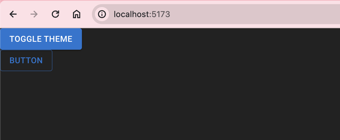
function App() {
const [light, setLight] = useState(true);
return (
<ThemeProvider theme={light?themeLight:themeDark}>
<CssBaseline/>
<Button variant='contained' onClick={() => setLight((prev) => !prev)}>Toggle Theme</Button>
<Test/>
</ThemeProvider>
)
}
export default App
来看看效果:

- 上一篇: mui: button
- 下一篇: markdown table 的用法